Showing posts with label Graphic Arts. Show all posts

Wednesday, January 8, 2014

These are Beautiful

What beautiful execution of a fantastical, far-fetched idea.  Modern art is being (one might say "has been") co-opted by graphic design, which itself has been co-opted by advertising.


Via Boing Boing.

Saturday, July 27, 2013

The World is Now in Color: Calvin & Hobbs

Click for a large image.


Saturday, March 16, 2013

Mastectomy Tattoos

This is a lovely idea: women who have had full or partial mastectomies have used tattoos to cover or incorporate their scars, turning what can seem a permanent disfigurement into a source of beauty and self expression.

At Babble.com there's a nice gallery -- likely safe for work unless you're surrounded by conservative nuts or work in North Korea. Via MetaFilter.

Thursday, February 14, 2013

I Thought This Was Lovely

A kiss should symbolize a harmonic unity in the meeting pair, heart and soul intertwined, and all feelings' scope encompassed.
Via Kottke and found at The Bygone Bureau, a guide to kissing written up and illustrated by Hallie Bateman from journal entries made by her mother "in 1976 when she was seventeen years-old and sitting on a train in europe somewhere."

With drawings as lovely as the words, owing a little to Lynda Berry and James Thurber, and more than a little to a romantic imagination.

Friday, February 8, 2013

Calvin & Hobbes in a Photographic World

Nite4awk, a user on Imgur has made some nice wallpapers using images of Calvin and Hobbes mixed into photographs. That is all. Via MetaFilter.

Wednesday, February 6, 2013

Grant Snider is a Font of Wisdom

Today's "Incidental Comics" by Grant Snyder tells of typography:

In libraries typography is always the elephant in the room. Via Tim!

Thursday, January 31, 2013

The Art of Tiago Hoisel

Tiago Hoisel is a Brazilian graphic artist/cartoonist specializing in rendering in Photoshop and (I assume) Illustrator and other rendering programs. Anyway, his work is awesome. A few examples, below.

[NOTE clicking on the first image below takes you to Lightbox on Blogger (displaying all the images in a strip) -- you can also see all the images in this post by clicking on the "Read more" link or you can go to the site here. If you choose "Read more" and click on any image but the first one it will take you to information on that image -- Hoisel's descriptions of the work and in a few instances animated gifs, etc., showing his process.]

Saturday, January 26, 2013

Fuck Yeah Dinosaur Art

Fuck Yeah Dinosaur Art is a tumblr blog I noticed from somewhere -- I think the awesome tumblr Scientific Illustration, but I can't find the link back -- but anyway, Fuck Yeah Dinosaur Art is fun to look at and often funny. Samples from some of its most recent posts:

The Golden Rectangle, Golden Ratio, and Phi as Design Criteria

James Gurney, of the wonderful blog Gurney Journey and Dinotopia fame, has a series of five posts on the golden rectangle and it's key ratio 1 : 1.618 ... (which is known as the golden ratio or φ). The crux is that the importance of the rectangle and the ratio is overstated and, while not belittling "mystical feeling" (my phrase and quotes), the supposed mystical role of the ratio is not factually grounded. He says it alot better than I could. So here's a list of his posts (with a brief description for each):
Part 1: Mythbusting the golden mean (the Parthenon) This post -- with extensive links at the end -- outlines the well established view and evidence that the Parthenon is not based on the golden rectangle or golden mean.
Part 2: The golden mean and Leonardo This post discusses Leonardo's "Vitruvian Man" drawing and that it reflects the ratios advocated by Roman scholar and architect Vitruvius, which are not the golden mean. that doesn't mean that Leonardo was unfamiliar with φ, but it is not evident it was central to his work.
Part 3: How the golden mean caught on with artists This post discusses the occurence of
φ in nature and how this developed a sort of mystical relevance for many which was given a sort of historical gloss.Part 4: The golden mean and the human body This post discusses the use of the golden mean by a number of artists, most notably Bauhaus architect/designers and Le Corbusier, and takes a middle view that we can learn from their work but it is not factually accurate on all counts.
Part 5: Last question about the golden rectangle The last question Gurney asks is whether the assertion that work designed with the golden rectangle/golden ratio is, in fact, more aesthetically pleasing. It can be if that is what appeals to the viewer, but it is not inherently so.

Friday, January 25, 2013

People Movin'

People Movin' is a website that uses HTML 5 to generate graphic presentations of the number of people moving from one country to another. It's designer, Carlo Zapponi, created it as an example of tools he is developing to generate data graphics using HTML. In theory the site could be designed to scrape the data continuously, giving something similar to a real time sense of the flow of data (for an example of that, see the wind map), but I doubt sufficient population data is available to make that feasible. The data shown is for 2010.

One thing I had not previously known but, accepting his data sources, do now:  People Movin' shows about 10% of the population of Mexico relocated to the USA in 2010. The total number -- about 11 million people -- dwarfs any other migration from one country to another that year. The USA as an immigration destination also dwarfs any other country.

The charts are cool to browse through though I think so far of not much use but the wow factor. Anyway -- it's worth a look. Via Neatorama.

Friday, January 18, 2013

Awesome Cell Illustrations

These scientific illustrations by Russell Knightly are stunningly beautiful. Seen at Fresh Photons.

Animal Cell
Plant Cell
Bacteria

Tuesday, January 1, 2013

It's 2013

Well, this is god damned annoying.

Sunday, December 30, 2012

The Best New York Times Graphics of 2012

I am going to be publishing some 2012 wrap-ups today and tomorrow -- there are too many to post them all in one night, and I've refused to start wrapping up 2012 before the end of the year. 

A great place to start is The New York Times's wrap up of its best interactive graphics of 2012. Every single one of these is an incredible piece of work and eclipses the most of the work I seeing elsewhere. They're so informative, so well designed, so beautiful that they deserve a separate post ... I'll be revisiting a few of these in subsequent posts related to some of their substance (I've published on a few in the past).


Tuesday, December 18, 2012

Nice Tat, Dude

I, admittedly, am not much of a tattoo fan, but this is a great set of tattoos:


Sunday, November 25, 2012

Lumen Type


Via Explore.

Friday, November 23, 2012

Turns Out There was No Battle Tech Marauder Present at the Winter Palace


As explained at Nothing to Do with Arborath, and a number of other sites, too, students were given the above picture to identify the conflict. It's the Storming of the Winter Palace during the Russian Revolution. Unfortunately, someone simply downloaded a copy from the internet without looking at it closely. There's a Battle Tech Maurader in the background.  Ooops. People are saying that is inaccurate.


Thursday, November 22, 2012

Dream Anatomy Redux

I previously posted a series of images from an exhibit at the U.S. National Library of Medicine named Dream Anatomy and, well, they were so awesome I thought I'd post some more. The Dream Anatomy site has background detail and dates for the images.

Wednesday, November 21, 2012

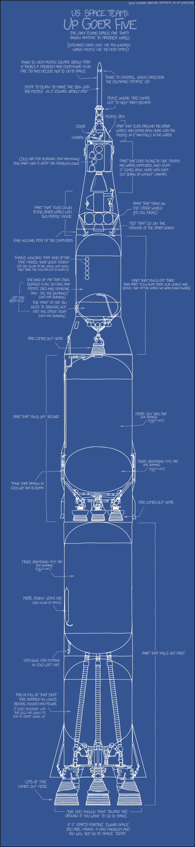
And I Said a Manned Space Ship will Never Go to Another World (in our lifetimes)

National treasure Randall Monroe has drawn a sketch -- a huge sketch -- of the Saturn V rocket with Apollo module attached and posted it on his website xkcd. The drawing is based on blueprints of drawings of the Saturn V from the web site found at the web site up-ship.com except that Monroe translates the engineering-ese into cool and funny plain-people-ese.

But I'm still sad about the stars.

Saturday, November 10, 2012

C215

C215 (given name Christian Guémy) is a French street artist (some call him the French Bansky, though I hate that, and he probably does, too) who layers stenciled images with sprayed and brushed paint. His is simply awesome. I thought about writing about why -- in fact, I've erased a lot of words on that, something about his work being an advertisement for humanity and life, with great technique and eye, etc. etc. -- but I should just let his work speak for itself.


Below the break, many more examples of his work. There's an extensive collection of his work at his Flickr page, as well as a set of images at Colossal (which reminded me of C215's extensive work). [N.B. this brings up the interesting question of why I would post images of work when they can be found on other sites. Early in the history of this blog I didn't. The images I post, though, show the ones I like or am interested in and, most importantly, help prevent losing them through link rot.]

So anyway ...

Friday, November 9, 2012

Illustrations for a New Edition of El Manifiesto Comunista

At the blog Brain Pickings last week there was a great post of images by Fernando Vicente (link to his post of the same at Behance) that illustrate a new Spanish edition of the Communist Manifesto. Now, I am not a communist -- indeed, I think some of its assumptions are absurd (I also think it's absurd to have to point out I am not a communist, but in the USA that's necessary) -- but that has nothing to do with whether these are great graphic art. And they are.

After the break, I've put a few of my favorites.